← Back to work

Pic'em

Product Design · UX Writing · Personal project

The challenge: many users share the same problem with their smartphone gallery: waaaay too many items to delete, and zero desire to do it.

Tinder-style cleaning for your gallery: 30 photos a day, you decide which lives and which dies.

As a smartphone user, I realized my gallery — like many around me — was filling up with selfies, duplicates, screenshots and memes that only steal storage. And even after deleting bunches of files now and then, my gallery kept growing faster. So I did what a product designer would: research whether the problem was just mine.

Research

It's not (just) about storage: it's about order

Surveys and interviews with friends, family and colleagues surfaced three takeaways that defined the product. First: we don't clean just for space. Every respondent admitted to wanting a cleaner, more organized gallery even without storage problems. The sheer volume makes the task feel harder, so it gets eternally postponed.

Second: we do it occasionally, not as a routine; in spare moments, travelling or out of signal, deleting between 100 and 300 files per session. And third, the most important: nobody wants an app deciding what gets deleted for them. User control was non-negotiable.

100%

wanted a cleaner, more organized gallery, even without storage problems.

84%

clean their smartphone only occasionally, in spare moments.

16%

had ever used a competitor's cleaning app.
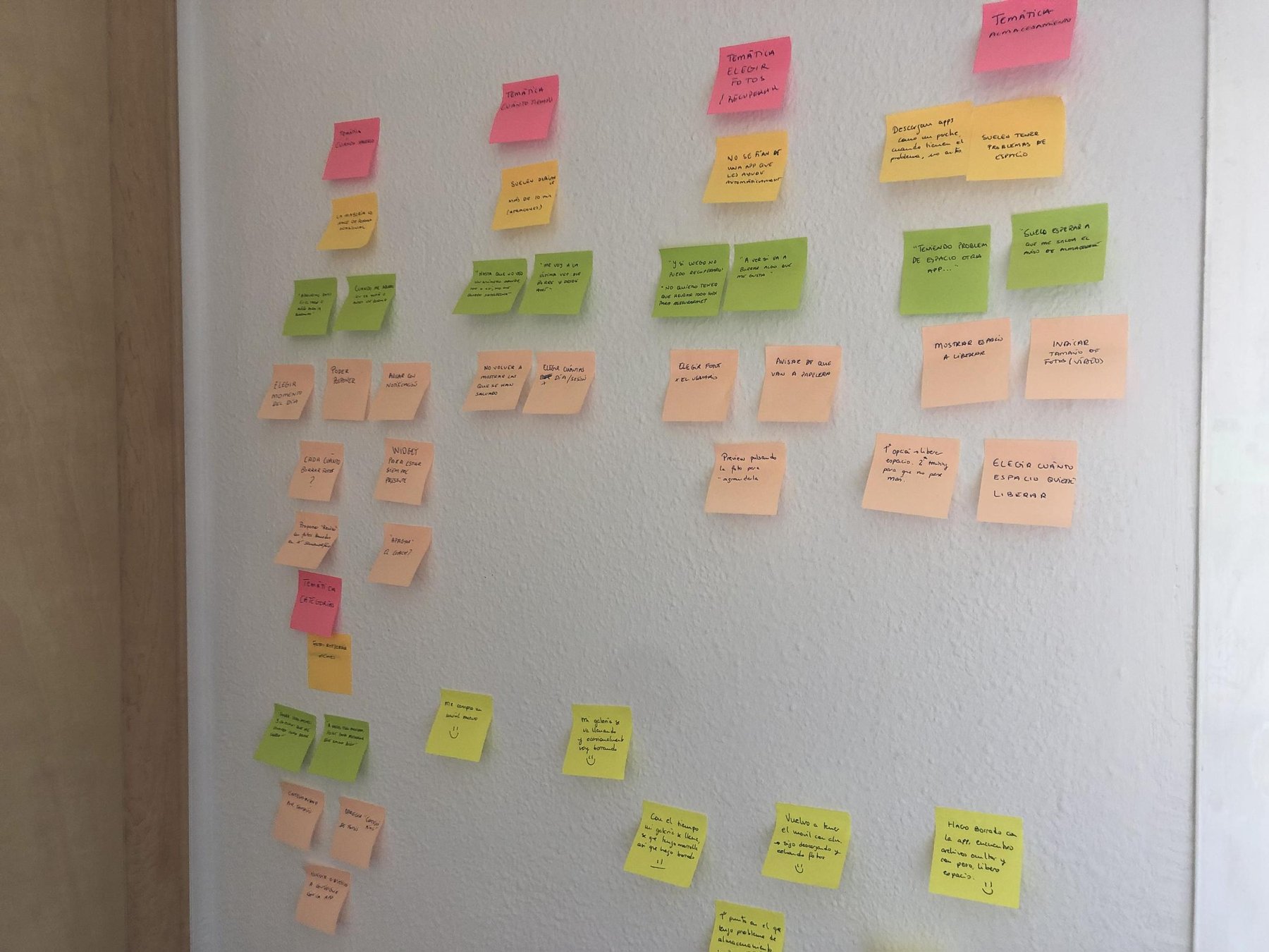
Pared de post-its con las conclusiones de la investigación agrupadas por temáticas

The research wall: survey and interview findings grouped by theme — storage, time, choosing and recovering photos, categories.
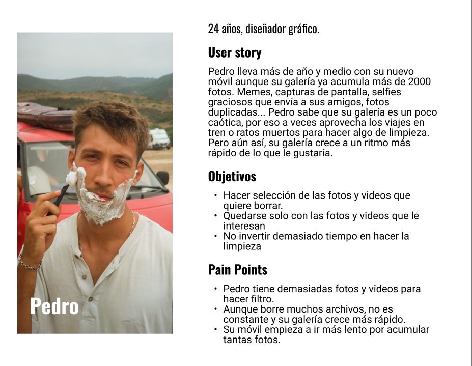
User persona: Pedro, 24 años, diseñador gráfico

Pedro, 24, graphic designer and official meme supplier in his friend group: the user persona.
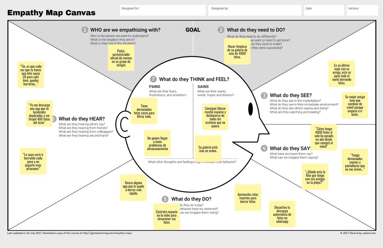
Empathy map de Pedro

The empathy map: what Pedro thinks, feels, sees and says about his 4,000-photo gallery.

The insight

Competitors free up space. But nobody builds the habit.

Every app on the market focuses on bulk deletion and reporting storage status. They work as a one-shot remedy for lack of space, not as a solution to the underlying problem. The opportunity was clear: help users build and keep a low-effort cleaning routine, nudged by daily notifications. Less "free up 4GB now", more "a little bit every day".


The design

Swipe to decide

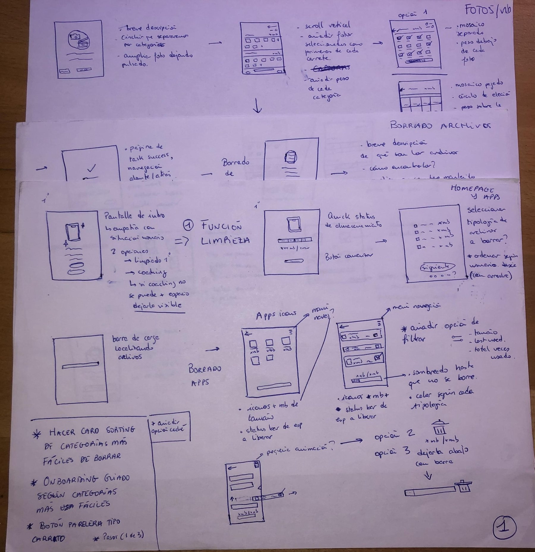
After two weeks wireframing on paper and Figma, I imitated the swiping mechanic of dating apps, familiar to the target audience (20-35) and able to turn a tedious task into something almost fun. Instead of bulk deletion, 30 items a day: an intermediate number that adds up to 210 a week, close to what interviewees deleted per session.

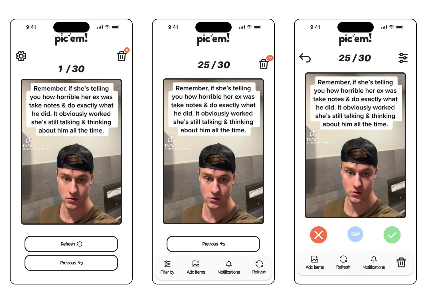
After several iterations and reviews with UX people, I simplified the actions to four: delete, keep, skip and rewind. Pic'em deletes nothing automatically, the trash only empties when the user decides, because the research made it clear: control is theirs. And a dropdown lets you filter by file category, one of the most requested features in the surveys.

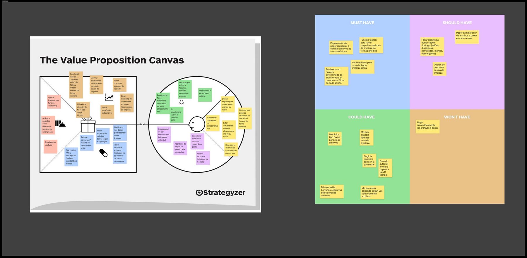
Value Proposition Canvas y priorización MoSCoW de Pic'em

Value Proposition Canvas and MoSCoW to scope the product: recoverable trash, sessions of 30, daily notifications as must-haves.

Wireframes en papel de los flujos de Pic'em

Two weeks of paper wireframes: cleaning flows, file deletion and homepage.

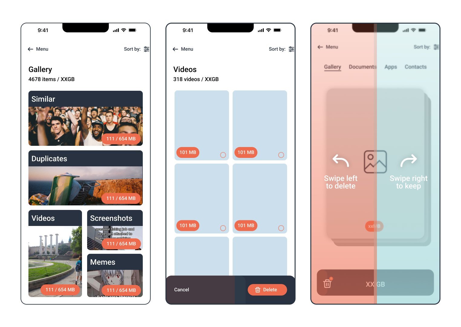
Primeras pantallas de Pic'em en Figma

First Figma screens: file categories, video selection and the swipe-mechanic tutorial.

Interfaz final de Pic'em con la mecánica de swipe

The final interface: swipe, daily counter of 30, trash and the 4 actions.


UX Writing

An app that talks to you like a friend

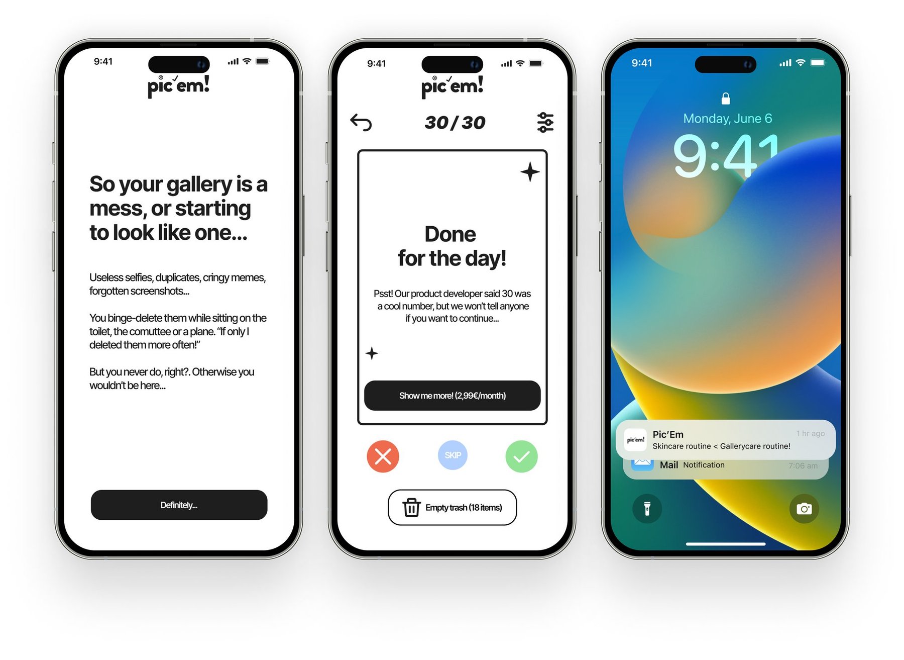
Before designing a single screen, I gave the brand a personality. Inspired by routines like skincare, I decided Pic'em would be more like the friend who reminds you, with love and a bit of sass, that your gallery is a mess, than a cold service obsessed with numbers. That voice lives in every interaction: the name and its tagline (little byte little), the onboarding, the notifications — "Skincare routine < Gallerycare routine!" —, the success messages and the empty states.

B*tch, you better be cleaning your gallery! 💅🏽

The brand personality, in one line.

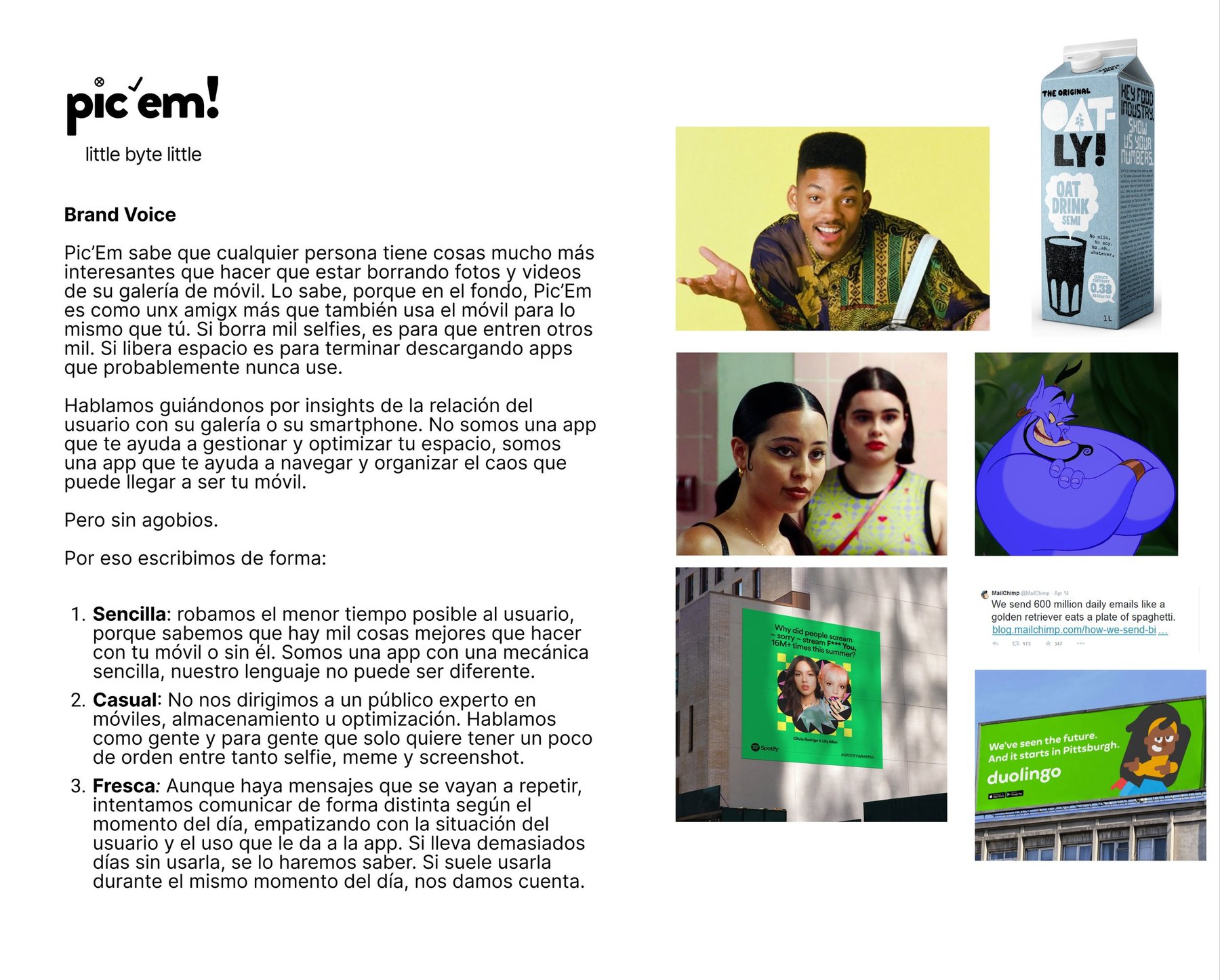
Página de brand voice de Pic'em: sencilla, casual y fresca

The brand voice — simple, casual and fresh — and its references: from Oatly to Duolingo by way of the Fresh Prince.

Pantallas con el UX writing de Pic'em: onboarding, fin de sesión y notificación

The copy in action: onboarding, the "Done for the day!" with upsell, and the lock-screen notification.


The product

From the Figma prototype to the AI prototype

In 2026 I revisited the project with a tool that didn't exist when I designed it: Claude. I rebuilt the original Figma prototype as a functional AI-generated prototype, where you can add your own photos for a realistic feel of the app. Two versions of the same product, a few years apart and a complete shift in how prototypes get built.

Some years after finishing this project, someone launched an app with an almost identical mechanic. I take it as the best market validation possible and as a reminder that good ideas are worth registering, too. Better luck next time.

Project presentation video.

Try the interactive prototype → See the original prototype (Figma) →

Got a similar challenge?

Let's talk →

Next project

Vans 3xtra Shoe →